Brand Style Guide.
The building blocks of the Fold & Field identity — logo, palette, type, and imagery direction. An internal reference for our team and collaborators.
Logo
The Fold & Field wordmark.
Our primary mark is the 'FOLD & FIELD / INTERIORS' wordmark set in our editorial serif, paired with a single olive-branch emblem. Use the ink wordmark on plaster and other light surfaces; reverse it to plaster on olive or ink for dark surfaces. Preserve clear space equal to the height of the ampersand on all sides, and never recolor, stretch, or add effects to the mark.
- Ink wordmark on light / plaster backgrounds
- Plaster wordmark on olive or ink backgrounds
- Clear space = height of the ampersand
- Never recolor, distort, or add drop shadows
Type & usage

Headings
Georgia, an editorial serif, sets every heading and the logo wordmark. Fluid sizing keeps hierarchy calm from mobile to desktop.

Body
The same serif family carries body copy at a comfortable reading measure — warm, considered, never clinical.

Color usage
Olive drives primary actions; aged brass marks accents and highlights; ink sits on plaster for all text. Keep white space generous.

Imagery
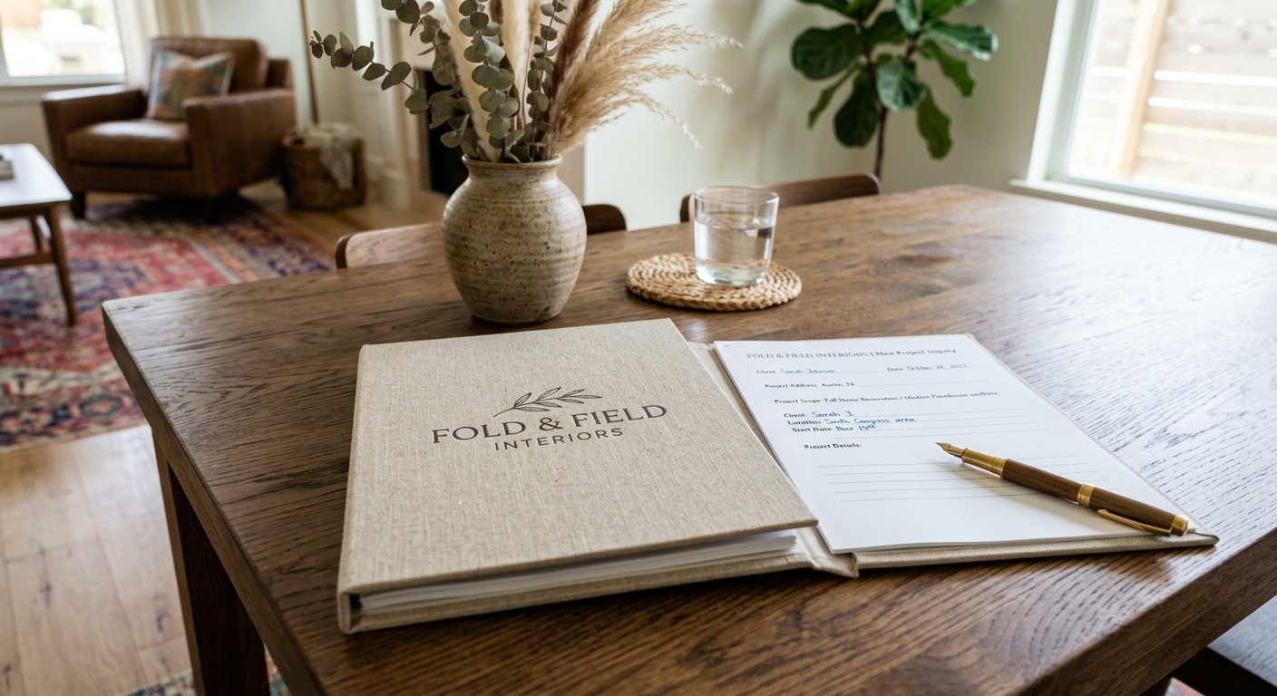
Warm, natural-light residential photography — plaster, olive, brass, and walnut, lived-in rather than staged.
Imagery direction
How our photography should feel
Natural light, honest materials, and rooms that look lived in. Warm neutrals grounded by olive and brass, with a person or a well-worn object to keep it human.

Natural light, warm neutrals 
Honest materials 
Lived-in, not staged
Reference
Questions about the brand?
This guide is a living document. Reach the studio for logo files or usage guidance.